
Virtual Assistants need business cards that work during real referrals, meetings, and follow-up. We create custom, print-ready artwork around the information clients and referral partners actually need.
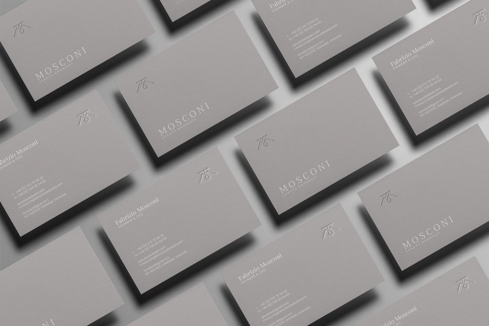
A virtual assistant business card should make the person's role, brand, and next contact action clear in a few seconds. For this profession, the working content set is:
The final card does not need every item when the brand or workflow makes a field unnecessary. We use the brief to decide what belongs on the front, what belongs on the back, and what should move to the website.
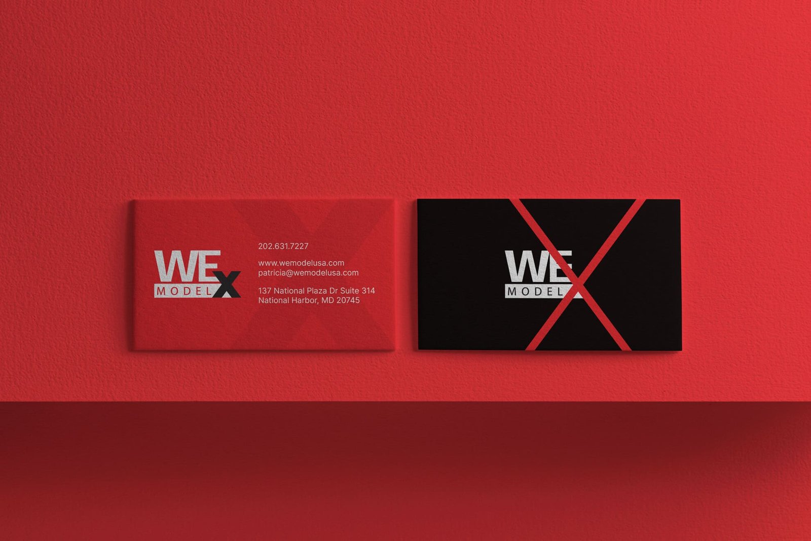
A card for virtual assistants is commonly handed over during networking, small-business referrals, and coworking events. The layout needs to survive that context. The recipient should be able to identify who gave them the card, what the person or company does, and how to continue the conversation without decoding a dense layout.
Professional-service cards need a clear value signal, role identity, and a direct path to the next conversation without filling both sides with sales copy. For virtual assistants, the design should give extra attention to name, business, and email.
The first reading level should carry name, business, and email. The next reading level can carry phone when used, website, and specialty. Details such as booking link, and time-zone or location only if useful can move to the back when the front becomes crowded.
A second card version can make sense when networking and small-business referrals require different contact routes. The variants should keep the same brand system rather than becoming two unrelated designs.
These projects show different typography, contrast, spacing, color, and finish directions. They are style references, not fixed industry templates.
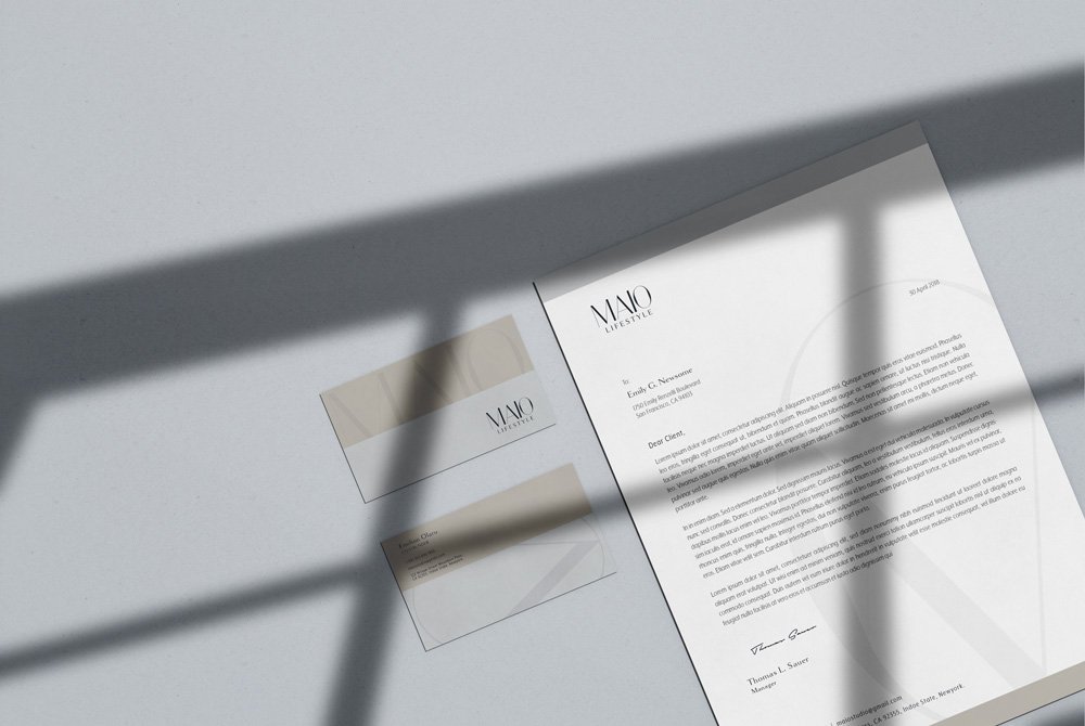
A useful direction is personal-service identity with specialty and booking path clear. Strong name and role hierarchy, concise positioning, and controlled use of brand color fit advisory and B2B handoffs. We adapt the layout to your existing logo, brand colors, type system, and any printer production limits rather than forcing a fixed house style onto every client.
The card can be minimal, bold, editorial, premium, technical, or highly branded. The right direction comes from the brand and the handoff context, not from a generic visual stereotype for the profession.
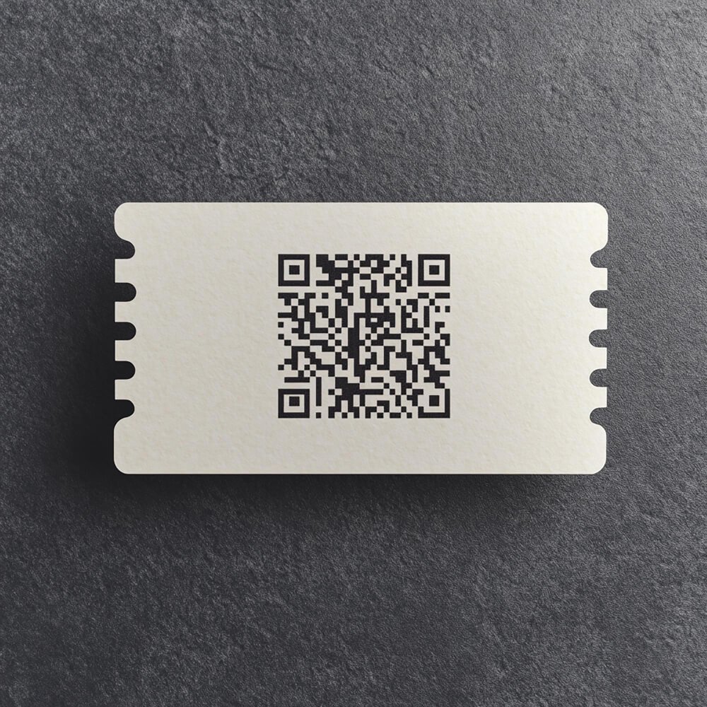
A QR code makes sense when it removes a real step after the card changes hands. For virtual assistants, a useful destination is the discovery call or services page. The code should point to a stable URL, have enough quiet space around it, and be tested at the final printed size before the files are released.
A QR code should not replace the core contact information. A recipient still needs a readable name, role, and direct contact route when scanning is inconvenient.
We size and position the code around the final printed card, then keep the human-readable contact path visible.
Three issues are especially easy to spot in this category:
We remove low-value elements before reducing type size. That keeps the hierarchy readable and leaves production space for trim, bleed, finishes, and printer tolerances.
One production option to discuss with the printer is clean matte stock. Premium matte, uncoated stock, blind emboss, or restrained foil can support a consulting brand when the finish stays subordinate to the information. The printer determines the final production specification, so we can adapt the artwork to a supplied die line, foil plate, emboss layer, spot color, bleed, or safe-area requirement.
Send the final spelling of every contact detail, your logo files, brand colors or guidelines when available, the card size, the printer specification if you already chose a printer, and 2 to 4 references that explain the visual direction you like. Tell us where the card is normally handed over and what you want the recipient to do next.
That information gives the concept a concrete job instead of turning the project into decoration.
No. We create the custom design and deliver print-ready files. Your local or online printer produces the physical cards.
Yes. We can design inside an existing identity and prepare the card around the logo, colors, typography, and production rules you provide.
Yes. Special-finish files can be prepared when the printer's production requirements are available. The artwork is adjusted to the actual process rather than guessed from a visual mockup.
Yes. A redesign can keep recognizable brand elements while correcting hierarchy, spacing, typography, contact information, QR placement, and print setup.
Send your brand files and the information that needs to appear on the card. Start your business card design project or compare the current packages.